
Business Card | Print & Identity Design
Project Overview
Design Process
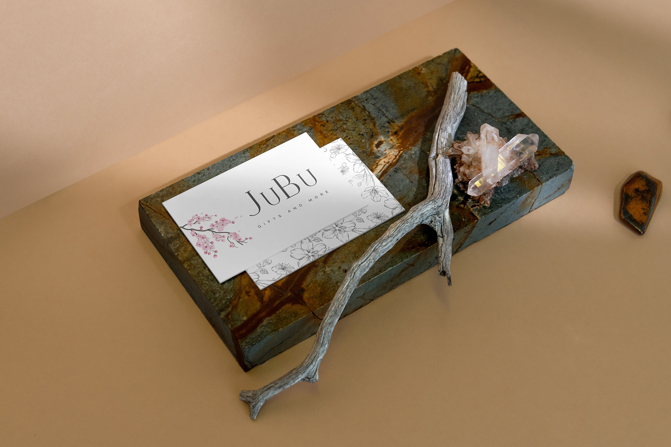
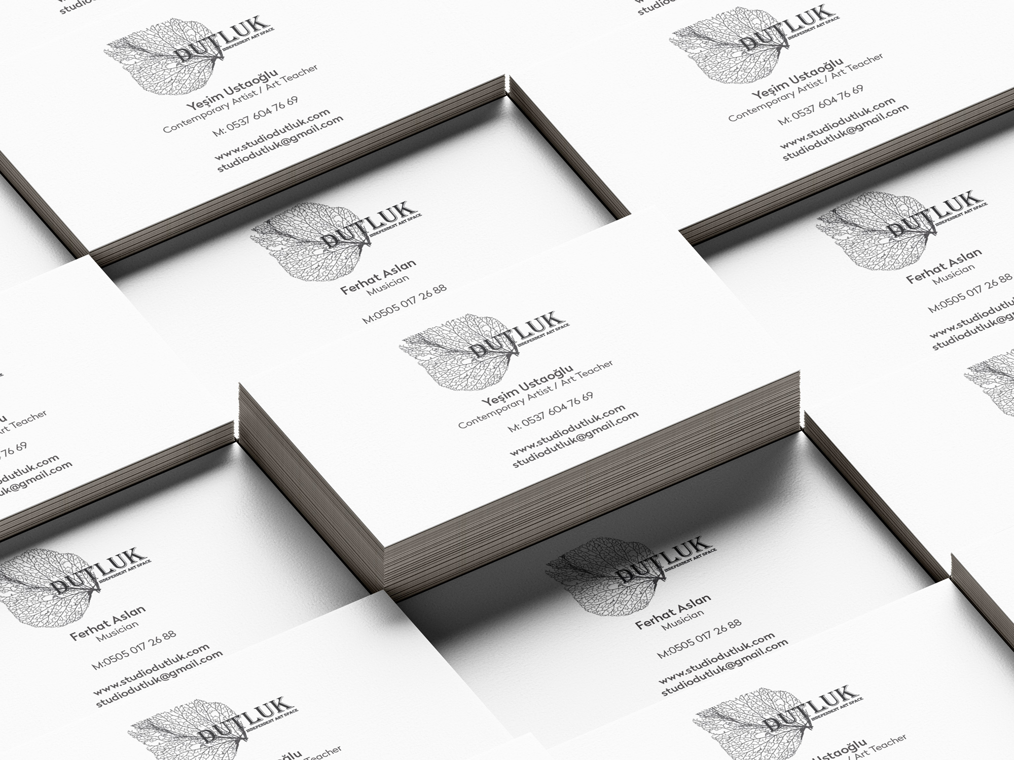
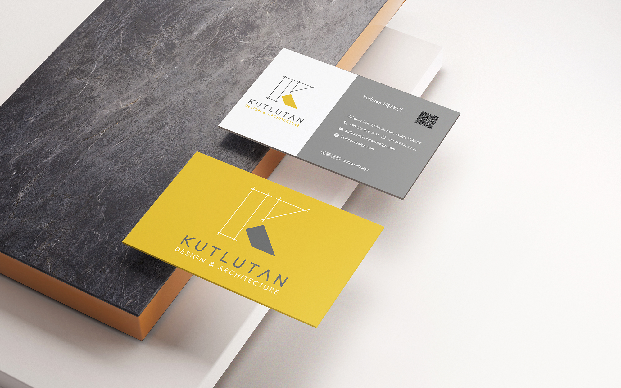
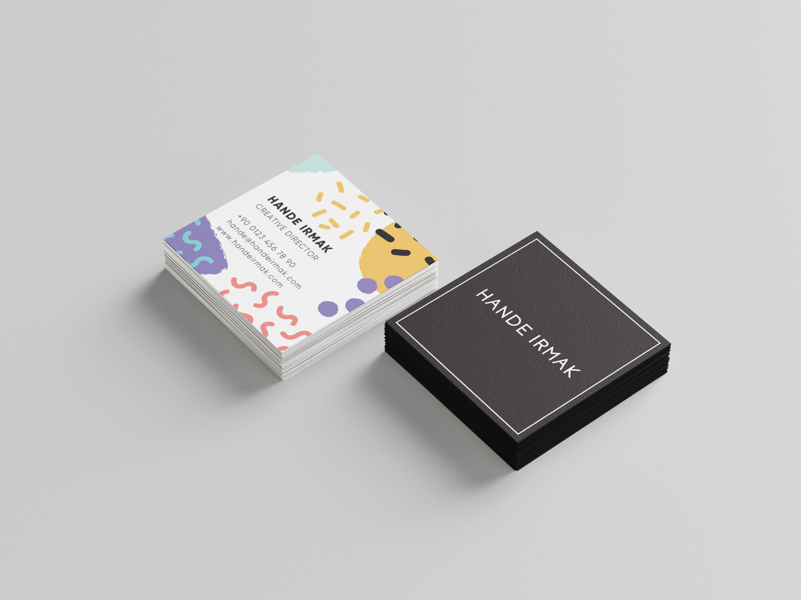
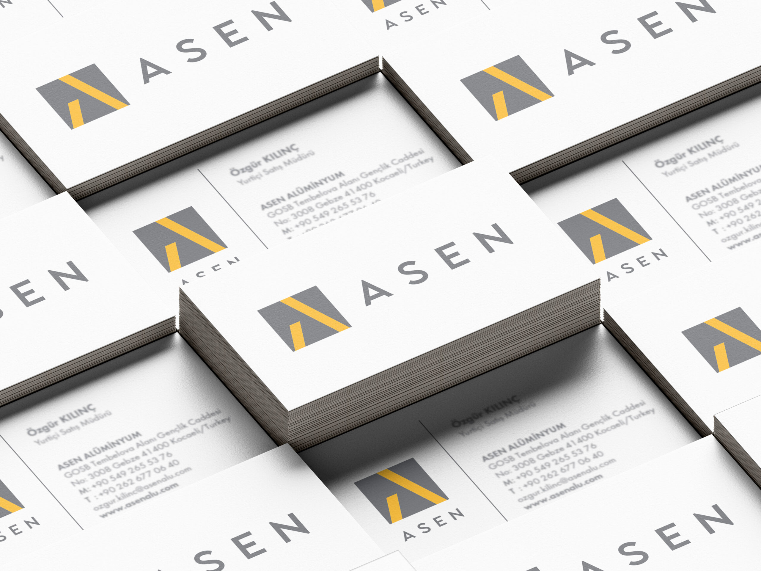
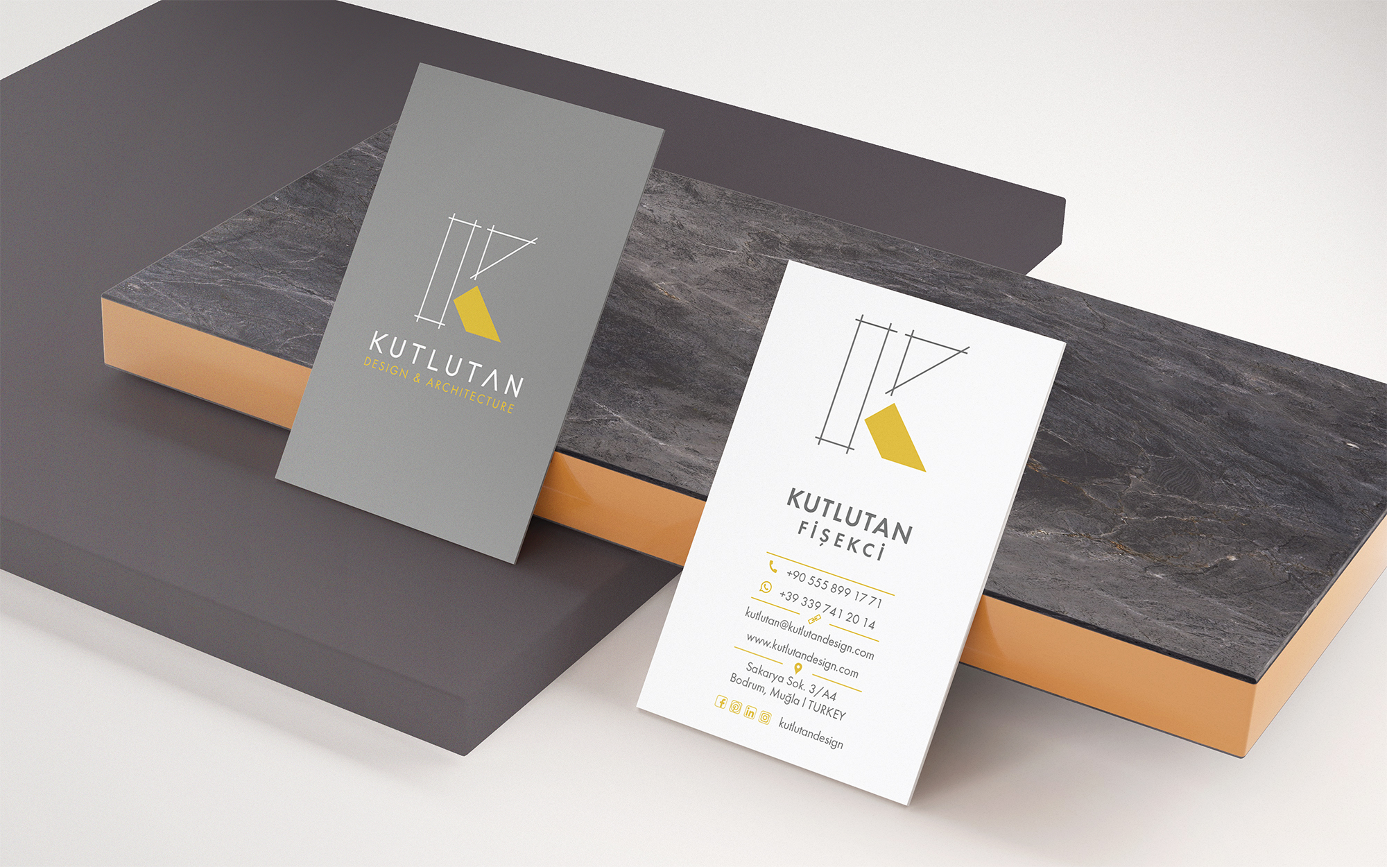
Every project began with a brand audit, understanding the tone, audience, and existing visual language before a single element was placed. Card dimensions, orientation, and print finish (matte vs. gloss, thick stock vs. standard) were considered as design decisions, not afterthoughts. Typography and white space carried most of the visual weight, with color used sparingly to reinforce hierarchy. Final layouts were delivered print-ready with bleed and safe zones defined.
Typography & Color
The typefaces across this series skew toward geometric sans-serifs and refined serifs, chosen for legibility at small sizes and elegance at larger display uses. Color palettes were pulled directly from each brand's identity system: deep neutrals, off-whites, and deliberate accent colors that photograph well and print consistently across paper stocks.
Tools used: Adobe Illustrator, Figma
Deliverables: Print-ready files (CMYK, 3.5×2 in with bleed),digital mockups